|
|
Post by wakefromthysleep on Aug 31, 2010 22:20:35 GMT
I'm a fan of good packaging and I must confess that I even bought things just because they were so damn well designed (psychological tricks obviously worked quite good even if I know about). One of them was a beer can from Danmark(I had never seen such a beautiful beer can!! it was amazing) and later I found out that it even got an award. The beer itself was tasteful btw and it wasn't too pricey so I didn't regret the purchase. I know that companies often improve sales by changing the package design - it's often just based on the demand for more money but there are also some design agencies who create modern, reasonable and ecofriendly packages for other aims than money. There are even packages of wich you can't clearly say if it's art or design. some are just allround masterpieces. you'll find some of them on this blog: www.thedieline.com/Needless to say that of course I don't only buy things for their outer appeareance. I just want to appreciate when packaging makes sense. - do you have a favourite package design? - do you even care about it? - what do you think about changing the design and design development? (you might all know e.g. how coca cola changend over time) |
|
skylarky
Apparition
 Ohhh that is negligent!
Posts: 23
|
Post by skylarky on Sept 1, 2010 0:47:32 GMT
Something interesting I saw today was called "water in a box."
it was very unique! i loved it :]
|
|
|
|
Post by helwin tins on Sept 1, 2010 2:33:49 GMT
my sister collects packaging. she has a massive box of things, some of it's quite cool, like drinks in glass bottles from japan where you have to push a glass ball into a glass bottle to open it, and some of it's just stuff like some gross german things called dickmans that she thought were hilarious.
|
|
|
|
Post by mimicry on Sept 1, 2010 2:45:29 GMT
I love those Japanese sodas! I forget what they are called.
|
|
|
|
Post by mynameisHughGrant on Sept 1, 2010 9:19:45 GMT
Packaging is so interesting and important. The whole world of design is really, seeing as we have to live in it. Even from a more analytical point of view, where packaging is designed to please specific consumer groups vs. a design point of view where packaging is there to serve a very specific function (like those Japanese soda bottles) I'd love to study that one day.
|
|
|
|
Post by husbandwifeheroin on Sept 1, 2010 12:09:11 GMT
Orangina bottles that are pear shaped and a bit dimply! (is that orangina? Or snowballs?)
The Baby Cham deer!
Practically all japanese food packaging ever
|
|
|
|
Post by wakefromthysleep on Sept 1, 2010 15:11:24 GMT
I love those Japanese sodas! I forget what they are called. (http://en.wikipedia.org/wiki/Ramune) That's what I thought too. Never heard of them before but the idea with the marble is fascinting. eta: as we recently talked about sonic vs mario.. gameboy condoms  eta: glorious wine labels - Mollydooker 1, 2, 3 - Magpie Estate 1 - James Jean for The Grateful Palate 1, 2, 3 - Killibinbin 1(mollydooker, magpie estate and killibinbin labels created by MASH. |
|
|
|
Post by helwin tins on Sept 1, 2010 15:31:43 GMT
I love those Japanese sodas! I forget what they are called. they're literally like syrup. if anyone's interested i could take some pictures of some of the more interesting items my sister has? |
|
|
|
Post by wakefromthysleep on Sept 1, 2010 15:57:59 GMT
^ yes! photos  |
|
|
|
Post by glumbumble on Sept 1, 2010 20:03:57 GMT
I have some swedish beer and cider cans from IKEA that I kept because they were so pretty (and because it's written in Swedish on it...). I like the dala horse that's on the Leksands knäckebröd so I put it in a frame.
The blog was really interesting, thanks for posting the link!
|
|
|
|
Post by husbandwifeheroin on Sept 1, 2010 20:06:41 GMT
Oh the Annas Pepparkakor tins! I knew I forgot something.  |
|
|
|
Post by glumbumble on Sept 1, 2010 20:08:32 GMT
|
|
|
|
Post by husbandwifeheroin on Sept 1, 2010 20:16:34 GMT
Oh I got one of those for Christmas but my box just had a photo of the house!  |
|
|
|
Post by irrelevant on Sept 1, 2010 20:28:15 GMT
i collect cereal boxes. at the moment i stand them up [whoaho balanced breakfast!] on various surfaces in my room kinda like the cardboard fine lit in ikea showrooms, but ultimately i plan to hang onto them for decades while collecting each new design that comes out. i figure in 30 years these will never be seen as neat as the ones from the 70s and 80s look now, but perhaps i'll still go so far as to frame a few of my faves. anyway they re-did the pop-tarts boxes...so now the '-tarts are shown being thrust upward into the spotlight as opposed to descending unto us like some heavenly offerings. not bad. it's more accurate that way. [to the image of pastries shooting out of the toaster] but the real headline is the deadline to find the older style before they all begin to filter out of the market. it was a move that basically turned bleak discount corner stores into museums housing priceless relics. gonna grab those up so quick the layer of dust atop them falls gently back to earth like a delicate blanket.  can't really say i like the changes so much. it's quite a bit cleaner now, which is a step in the wrong direction, imo. each box lost a great deal of personality now that the unique fonts and the tendency to have the pics of treats going over the edges have been scrapped. that little ribbon flourish, i can see they aim to make it look like they're 'bundling in' the item into the pastry but really it falls a little flat. and i know that both designs are worlds apart from the uk standard. but maybe for those they could add in an optical illusion and make that swirl start a-spinnin'. hypnotically drawing your hand to the graphic of the pop-tart. like a blackhole. just a thought. this is a mere crumb of all the pop-tart-related content i intend to contribute. |
|
|
|
Post by wakefromthysleep on Sept 1, 2010 21:13:02 GMT
^ it seems as if they intended to create a more dynamic design by adding the ribbon but I don't really see an improvement either. ...but this isn't clean. this chocolate (Chocolat Factory) is clean!   ------------- here's the beer I bought in danmark 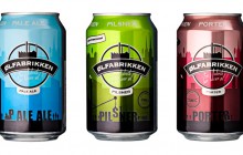 'liquid happiness' ..it looks better than it tastes and it's way too expensive but the colourfulness might cheer you up at the end of a day though 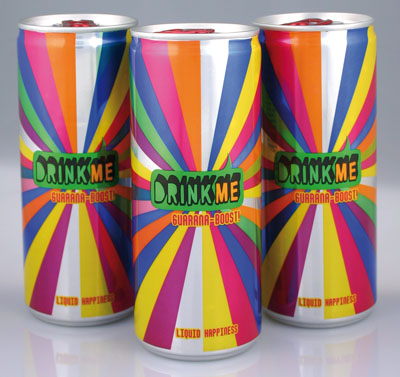 speaking of japanese packaging.. I saw teet milk one day on thedieline.com  Whole, skim and chocolate milk. This is a really unique, edgy concept for milk packaging by Ashley Linnenbank. The mark and packaging definitely draw on the feel and energy of things you'd likely see in packaging for the asian market of goods. Whole, skim and chocolate milk. This is a really unique, edgy concept for milk packaging by Ashley Linnenbank. The mark and packaging definitely draw on the feel and energy of things you'd likely see in packaging for the asian market of goods. |
|
|
|
Post by wanderer on Sept 1, 2010 21:28:49 GMT
I’m not really packaging-orientated but when I saw this I had to buy it because it had dragons on it:  actually, I will buy anything with dragons on :/ But I do just adore the artwork and it’s really nice tea too! |
|
|
|
Post by wakefromthysleep on Sept 1, 2010 21:41:11 GMT
^  |
|
|
|
Post by helwin tins on Sept 2, 2010 1:35:49 GMT
|
|
|
|
Post by wakefromthysleep on Sept 2, 2010 2:26:03 GMT
^ that's the answear for 'how to make a common can look good?'
thanks for posting it. (I haven't seen the film but now I want to)
|
|
|
|
Post by allison on Sept 2, 2010 2:48:11 GMT
i like this thread! i only buy books if they are under $3 or if i love the cover. this is to curb my book spending, but it also has made my personal library very attractive. this site has some a huge catalogue of pretty covers: bookcoverarchive.com/in a similar my mother, dog-maniac that she is, only buys wine/beer/alcohol that references dogs. when she's literally manic, this method of purchasing extends to every thing. its so embarrassing. |
|